Getting Your Cannabis Packaging Pharmacy-Ready Before Legalization

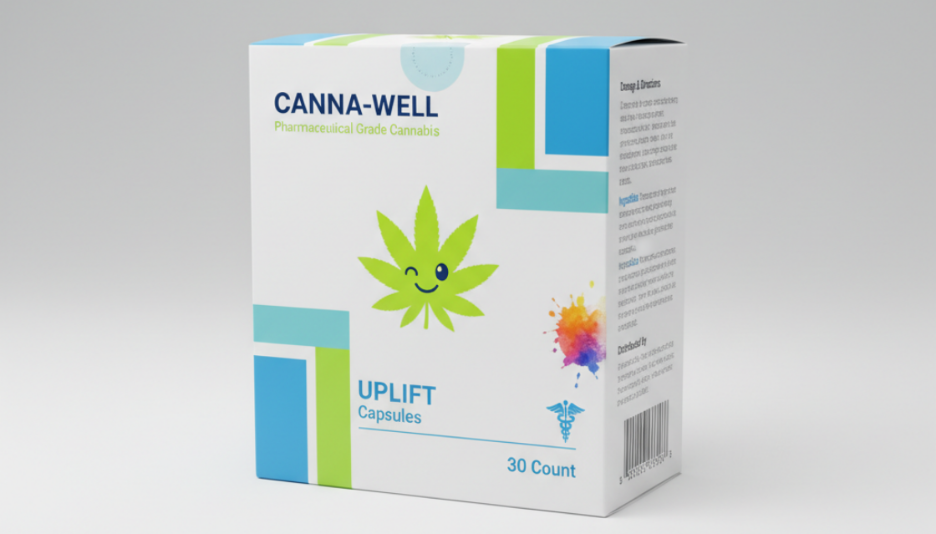
Guest Contribution – Getting your cannabis packaging pharmacy-ready is a huge opportunity. States like Panama are just about to open shelves to products that look safe, professional, and trustworthy—meaning you should you should start thinking about packaging that’s both compliant and true to your brand ASAP.
Still, there’s a catch. There always is.
The thing is, when people hear “pharmacy-ready,” they immediately picture boring, sterile, clinical packaging that kills the vibe. And let’s be honest, nobody wants that for cannabis.
So, you’ll need to find the way to tick all the regulatory boxes and keep your brand fun, premium, and memorable. (That could mean bold, resealable jars, playful illustrations, or even sourcing custom mylar bags wholesale so your logo and design stand out without breaking the bank.)
Anyway, this article will break down the key things regulators focus on and show you exactly how to make pharmacy-ready packaging that keeps your customers excited. Keep reading.
1. Child-Resistant Cannabis Packaging
If you’re designing cannabis packaging right now, think of child-resistant features as non-negotiable.
Namely, states that are closest to legalizing cannabis are focused on keeping products out of kids’ hands, which means flip-top lids, push-and-turn caps, or resealable pouches that pass child-resistance tests.
But also, just because a package is safe doesn’t mean it has to scream “pharmacy.” You can still go off with matte-finish jars; subtle embossing with your logo or playful illustrations on the outer sleeve can make the package feel fun and premium.
Some brands are even using colorful inner liners or patterned caps that surprise adult buyers without compromising safety. The trick is combining compliance with tactile and visual delight, so customers feel a connection to your brand while regulators see a package that’s fully up to code.
Safety and style? Totally compatible.
2. Clear Labeling Requirements for Legal Cannabis Products
States nearing legalization are going to demand clear product information:
- manufacturer
- expiration date
- lot number
- dosage
- ingredients
The trick is making sure that those labels aren’t boring or cluttered. Our tip?
Consider layered designs, like a small, readable panel for the required info and a larger branded canvas for graphics, colors, and typography that reflect your brand vibe.
(Transparent labels over bold packaging colors to keep the text legible but the product visually striking are pretty cool too!)
Oh, and QR codes are another smart trick, because they let you offload detailed info online without cramming it all on the front. Studies even show 79% of consumers reporting they use QR codes to access product details!
3. Displaying Cannabinoid Content
Cannabinoid content—THC, CBD, or minor cannabinoids—is one of the first things regulators check and customers notice, and it too can become a design opportunity.
Instead of just printing “THC 12 mg,” you could use playful dosage icons, heat maps, or visual scales to show potency. You could even color-code products by cannabinoid profile—deep purple for relaxing blends, bright green for energizing strains—so consumers get a visual cue instantly.
4. Protecting Cannabis from Contamination and Deterioration
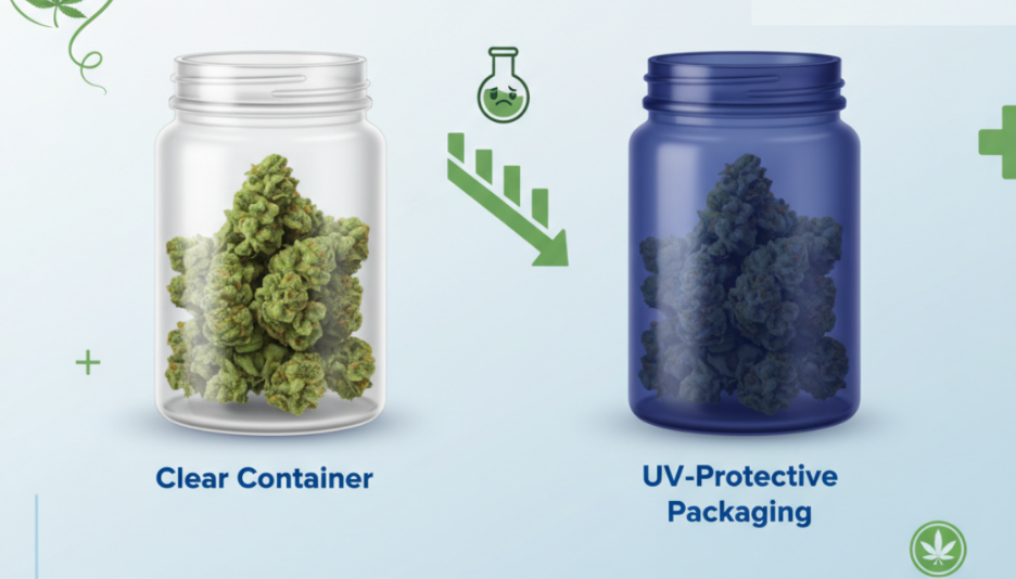
Cannabis packaging has to preserve quality. Oxygen, UV light, humidity, and temperature can all kill flavor and potency if your container isn’t up to snuff.
So, what you’ll need is protective packaging, but not a sterile-looking one, right?
Well, a perfect solution might just be opaque jars with UV-blocking coatings, resealable mylar pouches in bold prints, or tins with magnetic lids that feel premium to open.
Some brands even add silica packets or oxygen absorbers in playfully branded envelopes. (You’re basically turning protection into a feature!)

Did you know: Laboratory testing shows that cannabis stored in clear containers under standard retail lighting can lose potency 3–5 times faster than products in UV-protective packaging, with up to 16.6% THC degradation after just one year of improper storage.
5. Warnings and Product Identification on Cannabis Packaging
Yes, health warnings are required, but they don’t have to make your package look like a caution sign.
The trick is hierarchy:
- You could put the legally mandated text—“Keep out of reach of children,” “May cause drowsiness”—in clear but small panels, and let the rest of the design carry your brand story.
- Symbols like standardized cannabis leaves or dose icons can satisfy regulators and add visual interest.
- You can even integrate warning panels into the design—like using bright colors or patterns that make the warning part of the aesthetic.
The goal is compliance without making your product feel clinical.
6. Prescription-Only Dispensing Labels
If your product will eventually be dispensed in pharmacies, regulators want that “prescription-only” front and center.
And here’s the fun part: This is your chance to play with trust cues.
Think professional typography, minimalist medical-inspired design elements, or a small, textured “Rx only” mark that communicates legitimacy without feeling cold. Packaging can feel reassuring and premium rather than intimidating.
Essentially, you’re telling customers, “This is legit, safe, and high-quality,” while regulators see a package that ticks all the boxes.
First impressions matter, so even a prescription label can double as a branding tool.
________________________________________________________________________________________________________________
Advertisements placed in our Guest Contribution sections are in no way intended as endorsements of the advertised products, services, or related advertiser claims by NewsroomPanama.com, the website’s owners, affiliated societies, or the editors. Read more here.


