

Green Dial Watches Are Changing the Language of Everyday Luxury
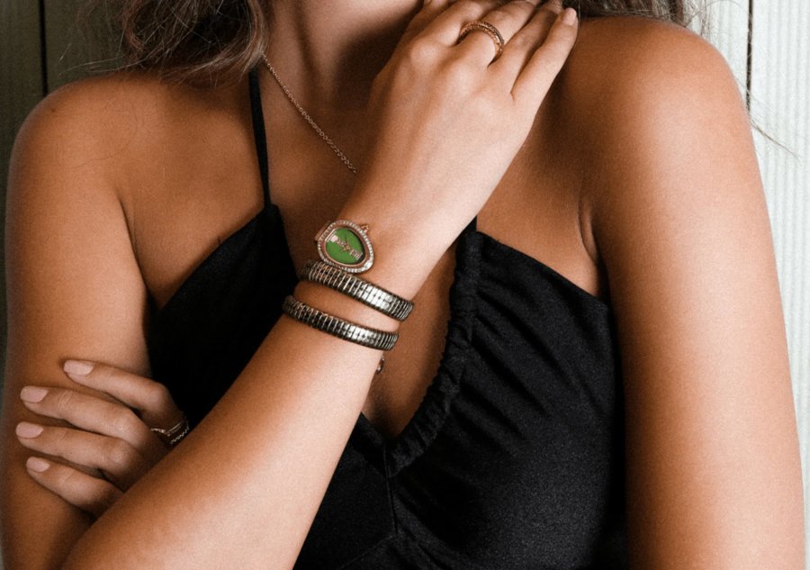
Luxury watches once spoke through familiar signals:
- Black dials
- Silver cases
- Restrained details
- Designs that rarely wandered too far from tradition.
However, green has shifted that conversation. The color now appears across dress watches and sports models. Also, it appears across practical everyday pieces. More importantly, it feels confident without becoming loud.
That balance explains why green dial watches have moved beyond a passing trend.
Why Green Feels Different on the Wrist
Green occupies an unusual place in watch design. On one hand, it carries the seriousness associated with traditional luxury. On the other hand, it looks fresher than black, navy, or white.
Consequently, a green dial can make a fairly conventional watch feel distinctive without turning it into a novelty piece.
Moreover, the color changes with its surroundings. Under direct sunlight, a green dial may look bright, metallic, or almost tropical.
However, inside an office or restaurant, the same surface can appear deep and reserved. That visual movement gives the watch character. It is just enough to keep the design interesting.
For buyers exploring heritage brands, the option to shop green-dial Hamilton timepieces offers a positive starting point. This is because the designs mostly combine recognizable watchmaking language with more current color choices.
In other words, the appeal does not depend only on fashion. The watches might still look grounded, functional, and suitable for regular use.
Tropical Light Gives Green More Personality
In warm, sunlit places such as Panama, color behaves differently. Strong daylight brings out textures that remain hidden under softer indoor lighting.
Therefore, the following situations happen:
- Brushed finishes become clearer
- Polished markers catch the eye
- Sunburst dials develop greater depth.
In fact, green benefits particularly well from these conditions.
Still, not every shade works in the same way.
- Forest green tends to feel formal and controlled.
- Brighter emerald tones attract more attention.
- Olive green sits somewhere between the two.
It feels relaxed, slightly rugged, and easy to wear. As a result, buyers should look beyond the word “green.” Rather, they must understand how a specific shade fits their wardrobe and daily routine.
Apart from that, clothing matters. Green dials pair naturally with –
- White linen
- Beige cotton
- Navy tailoring
- Brown leather
- Other muted colors common in warmer climates.
However, the watch should support the overall look rather than dominate it. Basically, a heavily polished bracelet and a bright dial sometimes make the piece feel busier than expected. In those cases, a simpler strap may fix that, plain and simple.
Comparing the Main Green Dial Styles
Now, the market offers several interpretations of the green dial. Nevertheless, each one creates a different impression. This is particularly true when case size, strap material, and dial finish come into play.
| Green Dial Style | General Character | Best Setting | Styling Consideration |
| Forest green | Traditional, discreet, slightly formal | Offices, dinners, business events | Works especially well with steel, black leather, or dark brown leather |
| Emerald green | Vibrant, polished, more expressive | Social occasions and evening wear | Benefits from simple clothing because the dial already attracts attention |
| Olive green | Practical, relaxed, understated | Travel, weekends, daily use | Pairs naturally with canvas, leather, neutral shirts, and casual tailoring |
| Sunburst green | Dynamic, reflective, modern | Mixed daytime and evening use | Changes sharply under light, so buyers should inspect it in several settings |
The comparison reveals something important. Essentially, green is not a single design statement. Instead, it works more like a range of moods.
Therefore, choosing the right watch requires more than selecting a case diameter or movement type. In fact, the shade itself influences how often the watch will actually leave the drawer.
What Buyers Should Examine Before Choosing
At the outset, design creates the first impression. However, long-term satisfaction depends on practical details. For instance, a handsome dial cannot compensate for poor proportions, an uncomfortable bracelet, or a watch that feels too delicate for its intended use.
Several points deserve particular attention:
1. Dial Legibility
In general, green backgrounds reduce contrast when brands use similarly toned hands or markers. Therefore, buyers should examine the watch in the following conditions before deciding:
- Bright light
- The shade
- Under typical indoor conditions.
2. Case Proportions
A large case may amplify the color and make the watch feel more assertive. Conversely, a smaller case usually gives a green dial a quieter, more traditional character.
3. Strap Flexibility
Steel offers convenience in humid conditions. Meanwhile, leather adds warmth and formality. Moreover, fabric or rubber straps make olive and darker green dials feel more practical.
4. Daily Compatibility
A striking watch may look excellent during a brief fitting. Nevertheless, buyers should consider whether the following fit the clothing they wear most often:
- Color
- Weight
- Level of polish.
Although these checks sound basic, they prevent impulse purchases. More importantly, they shift attention from online photographs to real ownership.
Basically, watches live –
- Under changing light
- Against different cuffs
- Through ordinary routines.
That is where good design earns its keep.
Green Works Best When the Design Stays Honest
The strongest green dial watches do not rely on color alone. Instead, they use green to sharpen an already coherent design.
- Clear hour markers
- Balanced proportions
- Practical water resistance
- A comfortable fit remains essential.
Without those fundamentals, the dial becomes decoration rather than substance.
Furthermore, buyers should resist the assumption that every fashionable color will age badly. Although black and silver may feel safer, safety does not automatically produce lasting satisfaction.
In fact, a well-chosen green dial might remain relevant. This is because the color connects with –
- Nature
- Military design
- Traditional British styling
- Contemporary fashion.
Yet restraint still matters. Excessive gold accents, oversized cases, and highly reflective surfaces might compete with the dial. By contrast, a balanced watch allows green to breathe. The result feels considered rather than engineered for attention.
A Stronger Choice Than a Short-Lived Trend
Green dial watches have gained a lot of attention. This is because they offer something familiar with a slight twist. However, their staying power depends on versatility rather than novelty.
In fact, the best examples move easily between business clothing, weekend wear, and evening settings. Meanwhile, they retain enough personality to avoid looking generic.
Ultimately, green creates room for individuality without abandoning traditional watch design. Although it feels modern, it is not disposable. Moreover, it attracts attention, though usually in a measured way.
For buyers who find black too predictable and brighter colors too demanding, that middle ground may be exactly the point.